🌈 Introduction: Why Color Is More Than Just Design
Before anyone reads your copy — they see your colors.
And those shades silently shape how people feel about your brand.
Research shows that up to 90% of first impressions are based on color alone.
That means your logo, website, or ad could attract or repel customers — without a single word being read.
Color psychology in marketing is the science of emotion through color — understanding how different shades trigger specific feelings, perceptions, and purchase decisions.
🎯 1. What Is Color Psychology in Marketing?
Color psychology in marketing explores how color influences human emotion and behavior.
In branding, colors are not just decorative — they’re strategic tools that:
- Build and reinforce brand identity
- Influence trust and perception
- Trigger emotional connections
- Drive buying decisions
The right color combination can make your brand instantly recognizable, emotionally appealing, and trustworthy.
👉 Example: Think of Coca-Cola’s red, Facebook’s blue, or Starbucks’ green — each color instantly conveys an emotion before you even see the logo.
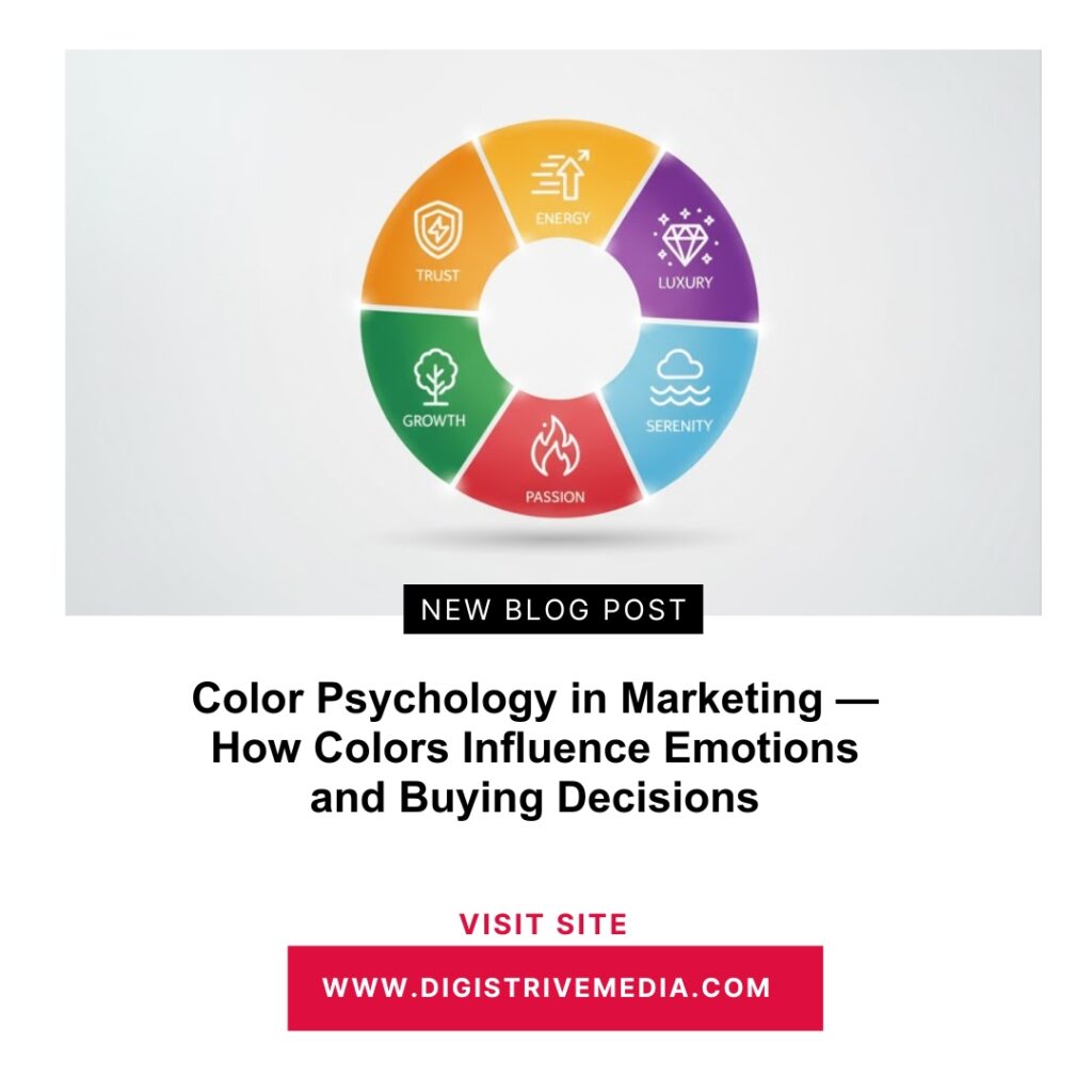
💥 2. The Emotional Language of Colors
Every color tells a story — and your audience subconsciously understands it.
Here’s what the main marketing colors communicate to the brain:
| Color | Emotion / Message | Best Used For | Famous Examples |
|---|---|---|---|
| 🔵 Blue | Trust, calm, professionalism | Tech, finance, healthcare | Facebook, PayPal |
| 🔴 Red | Excitement, passion, urgency | Sales, food, entertainment | Coca-Cola, Netflix |
| 🟢 Green | Growth, health, balance | Eco-friendly & wellness brands | Starbucks, Spotify |
| 🟡 Yellow | Energy, optimism, youth | Lifestyle & creative industries | McDonald’s, Snapchat |
| ⚫ Black | Luxury, sophistication, power | Premium & fashion brands | Chanel, BMW |
| ⚪ White | Simplicity, purity, clarity | Minimalist & medical brands | Apple |
| 🟣 Purple | Creativity, wisdom, royalty | Beauty & high-end products | Cadbury, Yahoo |
| 🟠 Orange | Enthusiasm, friendliness, fun | Retail & entertainment | Amazon, Fanta |
💡 Pro Tip: Don’t pick your favorite color — pick the one that matches your brand’s emotional message.
🧠 3. How Colors Affect Buying Decisions
Colors don’t just influence feelings — they drive action.
A well-selected color palette can:
- Increase brand recognition by up to 80%
- Boost conversion rates by 20–30%
- Reduce bounce rates through visual comfort
Example:
- Red “Buy Now” buttons outperform blue ones in eCommerce because red signals urgency.
- But in banking or tech? Blue wins — it evokes trust and reliability.
The key is emotional alignment:
Your color must match your brand’s purpose and audience expectation.
🎨 4. Choosing Colors for Your Brand Identity
Your brand colors are your emotional fingerprint.
They visually express your personality, promise, and purpose.
Follow This 3-Step Framework:
1️⃣ Identify Your Brand Personality
Ask: Is your brand playful, serious, premium, or natural?
2️⃣ Match the Emotion
Each personality aligns with a dominant emotion:
- Playful → Yellow, Orange
- Serious → Blue, Gray
- Premium → Black, Gold, Purple
- Natural → Green, Brown
3️⃣ Build a Balanced Palette
- Primary Color: Represents your main emotion
- Secondary Colors: Support tone and contrast
- Accent Color: Used for CTAs and attention-grabbing elements
✅ Example:
A wellness brand might combine green (health) + white (purity) + light blue (calm) for harmony and balance.
🧩 5. Color Combinations That Convert
It’s not just about one color — it’s about how colors interact.
The right pairings can amplify emotion and drive conversions.
| Color Combo | Emotion Created | Brand Example |
|---|---|---|
| Blue + White | Calm & Trustworthy | LinkedIn, IBM |
| Red + Yellow | Energy & Appetite | McDonald’s |
| Black + Gold | Prestige & Luxury | Lamborghini |
| Green + Blue | Balance & Peace | Nature & Tech Brands |
| Purple + Pink | Creativity & Inspiration | Beauty & Lifestyle Brands |
⚖️ Balance Tip:
Use contrast to guide attention, not overwhelm it. A clean color hierarchy improves visual flow and comprehension.
📱 6. Color in Digital Marketing: Where It Matters Most
Colors influence behavior across every digital touchpoint.
| Platform | Where to Use Color Psychology |
|---|---|
| Website | Background, CTA buttons, icons, typography |
| Social Media | Post aesthetics, thumbnails, and brand templates |
| Ads | Emotional contrast to grab attention fast |
| Email Marketing | Highlight offers and emotions with accent colors |
| Logos | Reinforce brand identity and recall instantly |
Consistency builds trust and makes your brand visually memorable.
🧬 7. The Cultural Side of Color Psychology
Color meanings change by culture — what inspires in one region might offend in another.
| Color | Western Meaning | Eastern / Global Meaning |
|---|---|---|
| Red | Passion, Love | Luck, Celebration (China) |
| White | Purity, Simplicity | Mourning (Japan, India) |
| Yellow | Happiness | Sacred, Royal (India) |
| Green | Nature, Growth | Prosperity, Fertility (Middle East) |
🎯 Global Tip: Always research your target market’s cultural perception before launching international campaigns.
⚙️ 8. How to Test Your Color Choices
Even emotional design needs data-driven validation.
Try These Testing Methods:
- ✅ A/B test different CTA button colors
- ✅ Use heatmaps (e.g., Hotjar, CrazyEgg) to track attention zones
- ✅ Check contrast ratios for readability
- ✅ Survey users for emotional reactions and preferences
🎯 Small color adjustments can increase conversions by 25–40%, especially in CTAs and landing pages.
💡 9. Real-World Case Studies — Color Psychology in Action
1️⃣ Coca-Cola (Red)
Triggers excitement and passion — symbolizing energy and happiness.
2️⃣ Facebook (Blue)
Represents trust, connection, and calm — ideal for social networking.
3️⃣ Starbucks (Green)
Evokes relaxation, balance, and nature — perfectly aligned with the brand’s “recharge” identity.
4️⃣ Apple (White & Silver)
Symbolizes purity, innovation, and simplicity — the essence of design perfection.
Each brand uses color as emotion, not decoration — making their message unforgettable.
✅ Conclusion: Choose Colors That Speak, Not Just Look Good
Color doesn’t talk — but it speaks volumes to the human brain.
It shapes emotion before logic even gets involved.
When you design with color psychology in marketing, you’re not just creating visuals — you’re creating feelings.
So, before you choose your next palette, ask yourself:
“What do I want people to feel when they see this color?”
Because the best marketing doesn’t just get seen — it gets felt.
📚 Quick Learning Recap
By mastering color psychology in marketing, you’ve learned:
- How each color triggers emotions and behavior
- How global brands use colors to influence trust
- How to create a consistent emotional color palette
- How to test colors for performance and engagement
Color is your silent sales language — make sure it speaks the emotion your brand stands for.
🔗 Internal Link Suggestions (Cluster Topics)
- The Psychology of Digital Marketing: Why People Click, Buy, and Share
- Emotional Marketing: How to Make Customers Feel Before They Buy
- The Science Behind Click-Worthy Headlines
- The FOMO Effect: How Scarcity & Urgency Drive Conversions
❓ Frequently Asked Questions (FAQs)
1. What is color psychology in marketing?
It’s the study of how colors influence human emotions and decision-making in branding and advertising.
2. How does color affect buying behavior?
Colors evoke emotions that drive trust, urgency, or comfort — directly impacting purchasing choices.
3. Which color is best for marketing?
It depends on your brand goal — blue for trust, red for excitement, green for health, and black for luxury.
4. How do brands use color psychology effectively?
They align their color palette with emotional intent — like Starbucks using green to represent calm and renewal.
5. Can color psychology improve conversions?
Yes. A/B testing colors in CTAs and ads can improve conversion rates by 20–40%.
6. How do cultural differences affect color meaning?
Different cultures interpret colors differently — red means luck in China but urgency in Western marketing.
External Source:
Learn more about global color perception from 99designs: The Psychology of Color in Branding